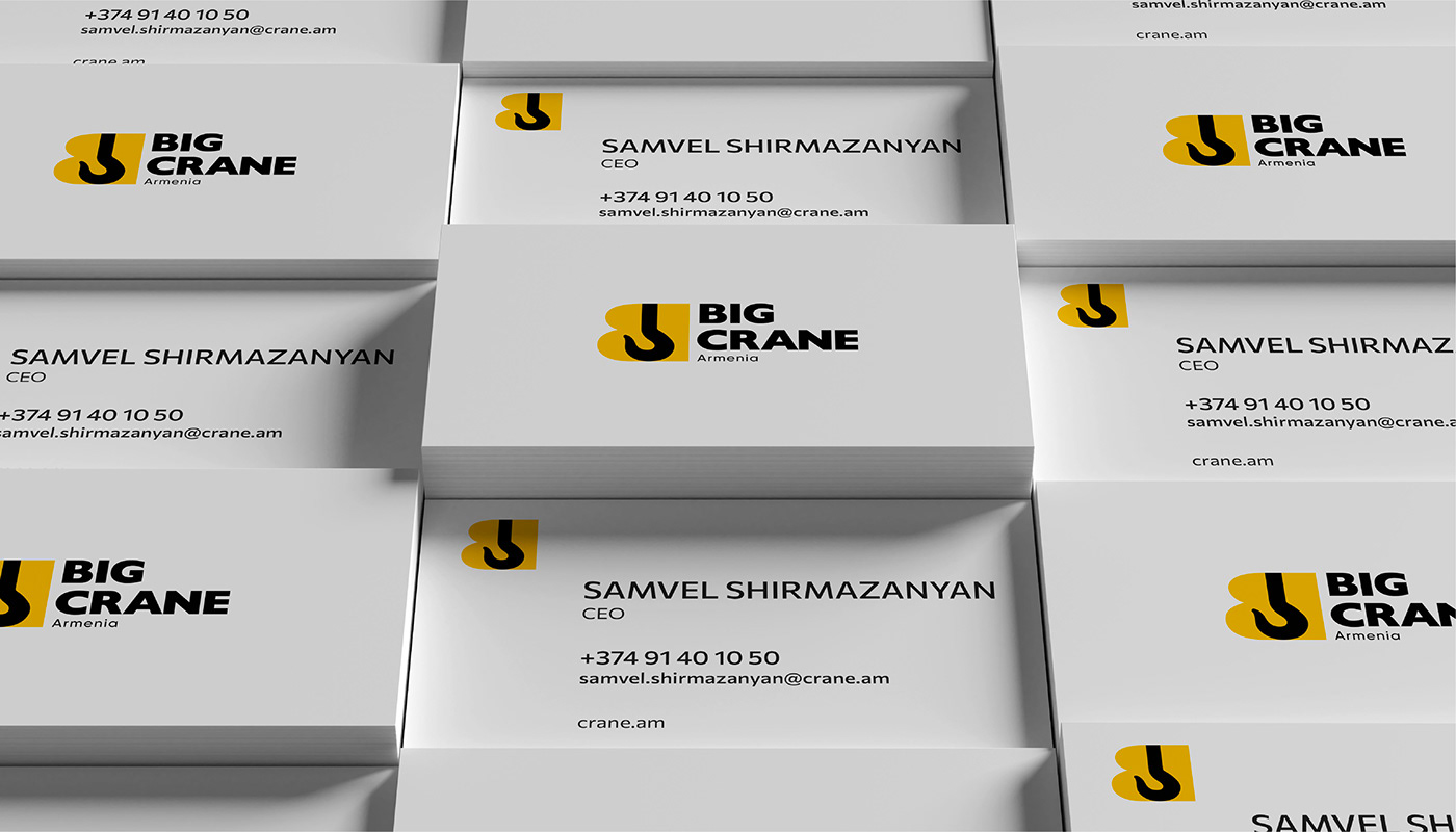
Big Crane Armenia, a leading provider of cranes and heavy construction equipment. Our mission was to infuse the brand with a fresh identity while preserving its industry legacy.
In this brand refresh, we aimed not just for aesthetic appeal, but to encapsulate the essence of Big Crane Armenia - a company synonymous with power, precision, and unwavering commitment to excellence. This reimagined identity positions Big Crane Armenia as a beacon of strength in the construction equipment industry, ready to reach new heights.

The focal point of the brand refresh is the new logo, a seamless integration of the letter 'B' and the distinctive hook of a lifting crane. Leveraging negative space, we ingeniously incorporated the crane hook within the letter, symbolizing precision and expertise. This design choice reinforces Big Crane Armenia's commitment to seamless, powerful solutions.


Our choice of typography mirrors the robust nature of Big Crane Armenia's products. Bold and heavy, the typography aligns seamlessly with the strength and durability of the machinery the company provides.


Staying true to the brand's roots, we retained the impactful black and yellow colours from the original logo. To enhance vibrancy and signify energy, we introduced a new shade of yellow, which is bolder, brighter and deeper, creating a visually striking contrast. This combination not only exudes power but also reflects sophistication and a dynamic, positive spirit essential to the industry.


